ARYA Skincare: Celebrating Nature’s Elegance
Brand Vision
ARYA isn’t just skincare, it’s a celebration of nature’s quiet magic. Think of it as luxury without the pretension. The goal was to design packaging that feels high-end yet approachable, mirroring the brand’s belief that the best ingredients come straight from the earth. Each product needed to scream “premium” while still feeling like it belongs in your hands, not behind a velvet rope.
Design Approach
The labels balance ornate details (like that delicate border) with clean, modern simplicity. Each product gets its own rich color backdrop, making it easy to spot your favorite at a glance. And that gradient gold leaf? It’s like catching sunlight on a forest floor, subtle sparkle without the bling.

Colors: Earthy Depths, Golden Glow
The palette mixes moody, nature-inspired bases with a dash of shimmering warmth:
-
Core Product Colors:
Saddle → Gondola A deep, velvety red for the Face Serum, like pomegranate juice. It’s bold yet soothing, mirroring the serum’s revitalizing punch.
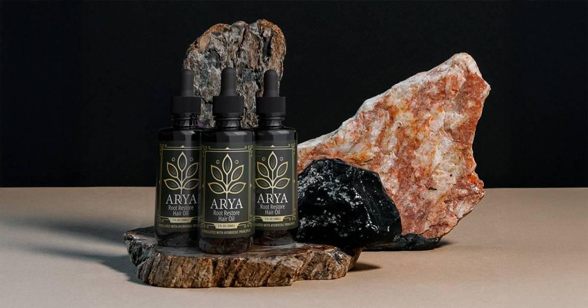
Mallard → Hunter Green A lush green gradient for the Hair Oil. This shade screams growth and vitality, just like the oil’s roots-to-ends nourishment.
Pickled Bluewood → Bunker A mysterious navy for the Beard Oil. Deep as the ocean, calm as midnight. Perfect for a product that tames and nurtures.
-
The Golden Touch:
Lightning Yellow → Pipi → Marigold → Flax → Lemon ChiffonThe leaf’s gradient shifts from warm honey to soft cream, mimicking sunlight filtering through leaves. It’s a hint of luxury that feels organic, not flashy.
Brand Consistency
That golden leaf isn’t just a logo, it’s the thread tying everything together. Whether it’s on a serum, oil, or balm, the Golden Leaf says “this is ARYA” while letting each product’s color tell its own story. Modern serif typography keeps labels crisp and legible, and ornate borders frame the design without stealing the show.

Why It Works
ARYA’s design bridges the gap between “treat yourself” and “trust the earth.” The deep colors feel rich and indulgent, while the golden leaf reminds you it’s all rooted in nature’s simplicity.
By keeping the vibe warm, the messaging clear, and the details intentional, we’ve created a brand that’s as nourishing to the eyes as it is to the skin.

